")
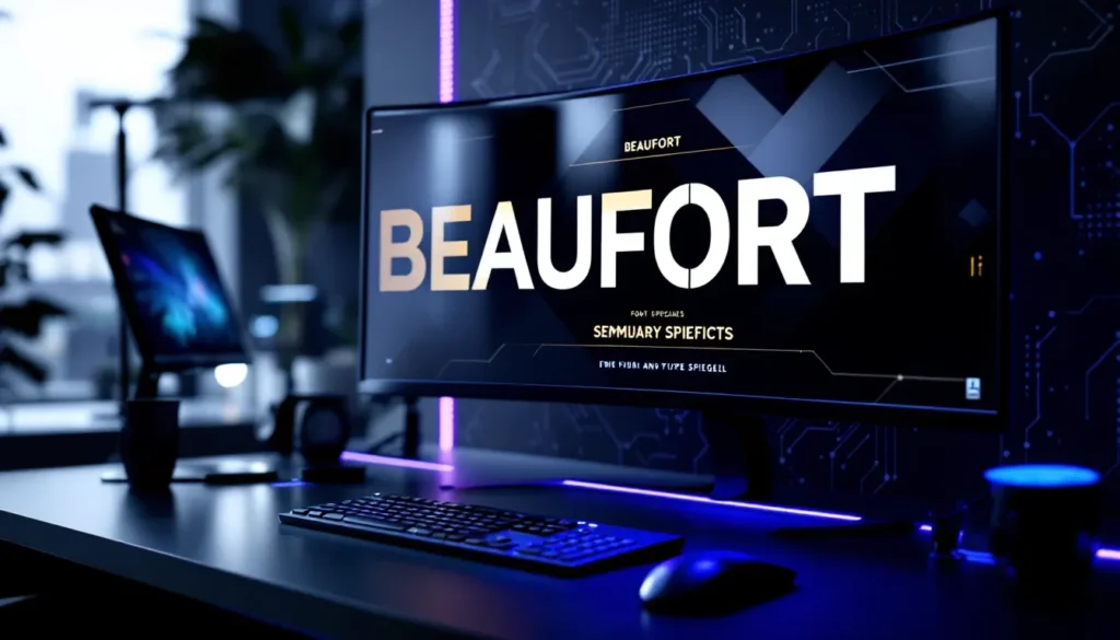
Table of Contents
ToggleIf you’ve ever watched League of Legends esports or scrolled through community content, you’ve probably noticed that iconic, angular typeface that screams Runeterra. The League of Legends font isn’t just a design choice, it’s a core part of the game’s identity. Whether you’re creating content, customizing your UI, or just curious about the typography behind your favorite MOBA, understanding the League of Legends font ecosystem opens up a whole new layer of appreciation for the game’s visual design. From the bold Beaufort used in championship banners to the clean Spiegel text in chat, these fonts are essential tools for both in-game clarity and professional content creation. This guide breaks down everything you need to know about the League of Legends font family, where to find it, how to install it, and how to use it for your own projects in 2026.
Key Takeaways
- The League of Legends font family consists of multiple typefaces—primarily Beaufort for bold headings and Spiegel for clean body text—designed specifically by Riot Games to reinforce the game’s visual identity and ensure readability across all scales.
- Beaufort and Spiegel fonts are officially available through Riot’s brand resources portal and legitimate third-party sites; always verify the source to avoid malware and ensure you’re using authentic, high-quality files.
- Installing League of Legends fonts is simple on both Windows (right-click and install) and Mac (drag-and-drop into Font Book), making them immediately available across all applications on your system.
- Content creators can leverage Beaufort for thumbnail titles, stream overlays, and graphics to boost professional presentation, while pairing it with Spiegel for secondary text creates strong visual hierarchy and brand recognition.
- Maintain design consistency across thumbnails, overlays, and merchandise by documenting your font choices, color palettes, and text treatments in a simple style guide to build viewer recognition and channel credibility.
- Always source League of Legends fonts from official Riot channels or verified creators, and avoid third-party client mods that modify the game client itself, as these violate Terms of Service and risk account bans.
What Is The League Of Legends Font?
The League of Legends font refers to the custom typeface family Riot Games designed specifically for the game’s branding, UI, and marketing materials. It’s not a single font, it’s a collection of typefaces that work together to create the game’s distinctive visual voice. These fonts are purpose-built for readability at different scales, from massive championship graphics to tiny in-game stat displays.
Riot Games didn’t slap a generic sans-serif on League and call it a day. The design team crafted fonts that reinforce the game’s aesthetic: modern, bold, and futuristic with hints of that Noxian edge. The fonts serve practical functions too. They need to remain legible whether you’re reading patch notes on your phone or watching a 60-foot screen at an esports stadium.
Understanding what makes these fonts tick is crucial if you’re creating League content, streaming, or just want to replicate the vibe. The font family includes several distinct typefaces, each optimized for different use cases. Some are perfect for headings and titles, others excel in body text, and specialty fonts handle unique branding needs.
The Official League Of Legends Font Family
Riot Games has publicly released information about their font family, and it’s more organized than you might expect. The main typefaces fall into a clear hierarchy, each with specific purposes in the League ecosystem.
Beaufort For Headings And Titles
Beaufort is the heavyweight champion of the League font family. It’s bold, angular, and instantly recognizable, the kind of font that demands attention. You’ll see Beaufort plastered across patch notes headers, champion splash art text, esports graphics, and any material that needs to command immediate focus. The font has a futuristic, slightly geometric quality that fits perfectly with League’s sci-fi Hextech aesthetic.
Beaufort comes in multiple weights (Regular, Bold, and sometimes Extra Bold variants), giving designers flexibility. The heavier weights are aggressive and commanding, perfect for titles and marketing materials. The design team specifically engineered Beaufort to remain readable at large scales without looking clunky. If you’re creating thumbnail text, banner headers, or promotional graphics, Beaufort is your default choice.
The font’s angular letterforms give League content an immediate professional edge. It signals “this is official, this matters.” That’s why League of Legends Prestige skin announcements and championship graphics always use Beaufort prominently.
Spiegel For Body Text
Spiegel is Beaufort’s cleaner, more approachable sibling. Where Beaufort commands attention, Spiegel facilitates communication. It’s the primary font for in-game text, patch notes body copy, and anywhere lengthy text needs to be readable without straining eyes. Spiegel has a more traditional sans-serif structure, making it excellent for sustained reading.
Spiegel works in all weights from Light to Bold, with the Regular weight being the standard for body text. The font is specifically optimized for screen rendering, meaning it won’t blur or become illegible at small sizes. This is critical for an online game where players need to read ability descriptions, chat messages, and item tooltips instantly during gameplay.
When you’re reading stat breakdowns or detailed patch patch explanations, you’re almost certainly looking at Spiegel. The font’s neutral personality makes it ideal for conveying information without distraction. If Beaufort is the hype machine, Spiegel is the reliable teammate who gets the job done.
Hextech And Secondary Fonts
Beyond Beaufort and Spiegel, Riot has developed specialty fonts for specific purposes. Hextech is a decorative font used for Hextech-specific UI elements, spell names, and fantasy flavor text. It carries more visual personality than the utilitarian Beaufort and Spiegel, with a more ornate, tech-forward design.
Riot has also released secondary fonts like Friz Quadrata for certain branding contexts, though Beaufort and Spiegel remain the workhorses. Secondary fonts are typically used in marketing materials, event branding, or special editions. They provide variety while maintaining brand consistency.
The entire font family was engineered to work cohesively. Using Beaufort for headings and Spiegel for body text creates visual hierarchy without jarring contrast. This consistency is why League materials look so polished, the typography reinforces the brand at every level.
Where To Find And Download League Of Legends Fonts
Finding legitimate, high-quality League of Legends fonts is straightforward if you know where to look. Riot Games has made fonts available through official channels, and several third-party sites host them legally. The key is avoiding sketchy downloads that could carry malware or corrupted files.
Official Riot Games Resources
Riot’s official brand resources portal is the gold standard for League fonts. The company maintains a dedicated assets page for content creators, esports organizations, and fans. You can access fonts like Beaufort and Spiegel directly from Riot’s servers, guaranteeing authenticity and the latest versions.
To access official fonts, visit the Riot Games brand resources website or the League of Legends official site. The brand guidelines section includes downloadable font files for approved use. Riot has been increasingly open about sharing assets with creators, recognizing that fan-made content drives engagement and community energy.
One critical note: Riot’s terms specify that their fonts are for League-related content creation. You can’t use Beaufort for your indie game or commercial project without explicit permission. But for League guides, stream overlays, fan art, and community projects, you’re in the clear.
Third-Party Font Websites
Several legitimate font repositories host the League of Legends font family. Game8 and other gaming resource sites have documented the exact fonts Riot uses, with download links to official sources. Websites like DaFont and Font Awesome sometimes host these fonts, but always verify the source.
When downloading from third-party sites, stick to established platforms with strong reputations. Look for fonts uploaded by official sources or verified creators. A font file should be a .ttf (TrueType Font) or .otf (OpenType Font) file, nothing else. If a site is asking you to disable antivirus or offering suspicious .exe files, back away immediately.
Reddit communities like r/leagueoflegends and designer forums often share direct links to official Riot assets. The community is generally helpful about pointing newcomers toward legitimate sources. Don’t hesitate to ask for clarification if you’re unsure about a download’s authenticity.
How To Install League Of Legends Fonts On Your Computer
Installing fonts on your computer is a straightforward process that takes just a few minutes. The exact steps vary slightly depending on your operating system, but the principle is identical: move the font file to your system’s font directory and let the OS register it.
Installation On Windows
On Windows, installation is dead simple. First, download your League of Legends font file (.ttf or .otf) to your Downloads folder or wherever you save files. Right-click the font file and select “Install” from the context menu. Windows will immediately copy the file to your Fonts folder (usually C:WindowsFonts) and register it system-wide.
Alternatively, you can navigate to Settings > Personalization > Fonts and drag-and-drop font files directly into the Fonts panel. Windows 11 makes this even easier with a dedicated font management interface. After installation, the font appears in any application’s font menu, Photoshop, Word, Discord, stream overlay software, everything.
If installation fails, you might have a corrupted file or insufficient permissions. Try running your application as Administrator or downloading the font file again. Once installed, restart any applications you want to use the font in. The font will be available immediately afterward.
Installation On MacOS
Mac installation is slightly different but equally straightforward. Download your font file, then open Font Book (Applications > Utilities > Font Book). Drag and drop the font file into Font Book, or use File > Add Fonts. Font Book will verify the file and ask where you want to install it.
Choose “Computer” if you want the font available system-wide, or “User” if you only want it for your account. After installation, the font is immediately available in all Mac applications. You can verify installation by opening Font Book and searching for the font name.
If you encounter issues on Mac, try installing fonts in a different location or checking that your Mac’s security settings aren’t blocking font installation. Generally, Apple’s font security is robust but occasionally raises false positives with legitimate downloads.
Customizing In-Game Text And Chat Fonts
League of Legends itself doesn’t allow players to replace in-game fonts, Riot maintains strict UI consistency across the client. But, you can customize how text appears on your display, and third-party tools offer limited customization options.
Adjusting Font Size And Scaling
The main customization happens through your client settings. Open League’s settings menu and navigate to Accessibility. Here you’ll find options to scale the UI and adjust text size. Scaling ranges from 75% to 200%, giving you control over how large or small menu text appears.
For in-game HUD, you can adjust minimap size, health bar text visibility, and chat window opacity. These settings don’t change the actual font, but they make text more or less prominent. Competitive players often reduce UI scale to maximize screen real estate, while players on smaller monitors or with vision difficulties increase it.
Monitor resolution also affects how fonts render. A 1440p monitor shows text crisper than 1080p at the same UI scale. If you’re setting up a new rig, higher resolution means text stays readable even at smaller sizes.
Also, some League of Legends Patch updates adjust font rendering or UI scaling. Check patch notes if you suddenly notice text looking different, Riot occasionally refines how fonts display to improve clarity.
Colorizing Chat And Interface Text
Chat text can’t be recolored in League’s official client, but cosmetic mods and client skins (available through community projects) offer limited customization. These tools let you change chat bubble colors, text colors, and UI theming without modifying core game files.
Keep in mind that using third-party mods violates Riot’s Terms of Service. The company aggressively bans accounts caught using cheats, hacks, or unauthorized client modifications. Even innocent-looking cosmetic mods can trigger bans. If you want visual customization, your safest bet is adjusting settings within the official client.
Stream overlay software gives you more freedom. When streaming, you can display chat, stats, and alerts using any font you want. Streamer-friendly tools like OBS Studio support font customization completely, you’re not modifying League itself, just your broadcast presentation. This is the legitimate way to spice up your stream’s visual presentation.
Using League Of Legends Fonts For Content Creation
The real power of having access to League’s fonts is content creation. Whether you’re building thumbnails, stream overlays, or merchandise, these fonts instantly communicate “official League of Legends” to your audience. Content creators, streamers, and esports organizations all leverage these fonts to maintain brand consistency.
Creating Thumbnails And Graphics
Thumbnails are your first impression on YouTube and social media. Using Beaufort for titles makes your thumbnails instantly recognizable as League-related. The bold, angular letterforms work great at small sizes, they remain readable even when your thumbnail is shrunk to an icon.
Layering Beaufort for titles with Spiegel for secondary text creates visual hierarchy. Your title “DOMINATE MID LANE” in big Beaufort with “New Akali Guide” in smaller Spiegel text guides the viewer’s eye naturally. The contrast between the two fonts feels intentional and professional.
When designing graphics, remember that League’s fonts look best with minimal drop shadows and clean backgrounds. Riot’s design aesthetic is modern and minimal, busy, heavily shadowed text looks amateurish by comparison. A simple color overlay or border around your title text works better than complex effects.
For thumbnails specifically, test how your text looks at 200×112 pixels (YouTube’s standard thumbnail size). If text becomes unreadable that small, it’s too thin or has too many thin letterforms. Beaufort’s bold weight is specifically engineered for this problem.
Designing Stream Overlays And Panels
Stream overlays benefit hugely from League fonts. Your branding, alerts, and information panels immediately feel more cohesive using Beaufort and Spiegel. Twitch streamers have discovered that League-styled overlays boost their professional presentation significantly.
For overlay design, Beaufort works great for alerts, raid notifications, and highlight boxes. When a new subscriber joins, their name could appear in Beaufort, immediately communicating importance. Spiegel handles less critical information like follower goals or current game info.
Color is crucial. League’s standard palette includes deep purples, golds, and silvers. Beaufort in white or gold against a dark semi-transparent background reads instantly, even on busy game footage behind it. Avoid neon colors, they clash with League’s refined aesthetic.
Animation adds polish. Text that fades in and slides from the side feels more professional than static text appearing instantly. OBS Studio and streaming software handle these animations smoothly. A quick entrance animation followed by static display keeps visual noise low while maintaining impact.
Building Custom Banners And Merchandise
If you’re designing YouTube banners, Discord server headers, or merchandise, League fonts elevate your branding immediately. A Twitch banner using Beaufort with your channel name and Spiegel for your description looks leagues above generic sans-serif alternatives.
For merchandise (within legal bounds, you can’t sell unauthorized League apparel), fonts become part of your personal brand. If you’re creating fan merchandise or using League fonts in promotional materials for content, the typography matters. T-shirts, hoodies, and posters all benefit from clean, recognizable lettering.
Merchandise design requires one critical consideration: printing. Some thin fonts become illegible when printed, especially on dark fabrics. Beaufort and Spiegel print well because they were engineered for clarity. When exporting designs for production, use high-quality vector files rather than rasterized images, this ensures crisp, clean text at any size.
Consistency across platforms builds recognition. Using the same fonts on your YouTube banner, Discord server, and merchandise creates a cohesive brand identity. Viewers recognize your content immediately because you’ve maintained visual consistency.
Font Pairing And Design Tips For League Content
Knowing which fonts to use is half the battle. Pairing them effectively and following design principles separates amateur content from professional-looking material.
Complementary Fonts For Web Projects
If you’re building a League fan site or content hub, you’ll likely use League fonts for branding but need supplementary fonts for body text. The safest approach is pairing Beaufort with standard web-safe fonts like Inter, Roboto, or Open Sans for body content.
Why not use Spiegel everywhere? Spiegel is excellent for League branding, but it has limited weights and style variants. For extensive web projects needing italics, narrow variants, or extensive multilingual support, web-safe fonts cover more ground. Pair your League fonts for titles and headings, then switch to reliable web fonts for everything else.
The key principle: Beaufort and Spiegel establish League identity, while supplementary fonts maintain readability and functionality. Your nav menu can use Roboto, your article body text can be Open Sans, but your site title must be Beaufort. This creates immediate visual recognition while keeping the site functional.
Color contrast matters enormously. Whatever supplementary font you choose, ensure sufficient contrast against your background. WCAG standards recommend at least 4.5:1 contrast ratio for body text. This keeps your site accessible and readable.
Maintaining Brand Consistency
Consistency is the foundation of professional branding. If your thumbnails use Beaufort Bold, your overlays should too. If your graphics use a specific color palette, stick with it. Viewers start recognizing your content instantly when visual elements remain consistent.
Create a simple style guide for yourself if you’re doing extensive content creation. Document which fonts you use for titles (Beaufort), body text (Spiegel), and accents. Note your color palette, margin sizes, and text treatments. This doesn’t need to be complicated, even a single reference document prevents those “wait, which font did I use last time?” moments.
Riot’s brand guidelines are available publicly and show how professionals approach League design. Study those materials. Notice how Beaufort never competes with background imagery, it’s either white, gold, or a solid color for maximum clarity. Notice how Spiegel body text always has generous padding and line spacing for readability. These aren’t arbitrary choices: they’re the result of professional design thinking.
When creating content series or recurring segments, maintaining typography consistency builds anticipation. Players will recognize your format instantly, your intro animations, your font choices, your color treatments. This recognition translates to viewer retention and channel growth. Invest time upfront establishing standards, then follow them religiously.
Common Issues And Troubleshooting
Even though straightforward installation and usage, font issues occasionally emerge. Understanding common problems and their solutions saves frustration.
Font Not Displaying Correctly In-Game
If you’re not seeing League fonts in-game, first remember that League’s client uses these fonts system-wide, but you can’t replace in-game fonts. If you installed the font specifically for the client, verify it’s installed by checking your system’s font settings.
On Windows, open Settings > Personalization > Fonts and search for the font name. If it’s not listed, reinstall it. If it is listed but appears wrong in-game, try clearing your client cache. Navigate to League of Legends installation folder > Config, delete the cache folder, and restart your client. League will rebuild the cache using the installed fonts.
On Mac, open Font Book and verify the font shows no warning icons. A warning icon means the font file is corrupted. Delete it and download a fresh copy from official sources.
Browser-based issues are different. If you’re trying to use League fonts on a website, you need to embed them properly using CSS @font-face rules. Simply having the font installed on your computer isn’t enough, you need to host the font file on your server (within legal boundaries) and reference it in your CSS. This is technical territory requiring some web development knowledge.
Compatibility Issues On Different Systems
Fonts sometimes behave differently across Windows and Mac. A font that renders beautifully on Windows might look slightly different on Mac due to different font rendering engines. This is normal and not a sign of problems.
For content creators concerned about cross-platform appearance, the safest approach is testing on both systems before publishing. If you’re creating graphics for streaming, test them on your actual streaming system. If you’re designing for web, preview in browsers on multiple operating systems.
Older versions of Windows (pre-Windows 10) sometimes struggle with newer font files. If you’re supporting legacy systems, download older font versions if available. But, for modern gaming content, this is rarely necessary, almost all League players use current OS versions.
Font substitution happens when a system can’t find a font, it automatically replaces it with a fallback font. If your viewers see different fonts than you designed, they might not have installed the font. Web projects solve this by embedding fonts, ensuring everyone sees identical typography regardless of what’s installed locally.
If you’re sharing design files with collaborators, include the fonts in your project folder or provide clear installation instructions. Nothing derails a project faster than teammates unable to open files properly due to missing fonts. Communication upfront saves headaches downstream.
Conclusion
The League of Legends font family represents more than just pretty typography, it’s a core pillar of the game’s identity and professionalism. Whether you’re diving into esports content, streaming competitive games, or creating fan art, understanding these fonts gives you immediate credibility. Beaufort commands attention, Spiegel communicates clearly, and together they form the visual backbone of one of gaming’s biggest franchises.
Accessing and installing these fonts is straightforward through official Riot channels and legitimate third-party sources. The real magic happens when you understand font pairing, design hierarchy, and brand consistency. Professional content creators recognize that typography choices separate amateurs from pros. Using League’s official fonts positions your work alongside official League media, instantly boosting perceived quality.
As you create thumbnails, design overlays, or build community projects, remember that these fonts carry the weight of League’s global brand. Use them intentionally, maintain consistency, and always source them legitimately. The esports community notices effort and authenticity. Apply these principles, and your League content will stand out in an increasingly competitive creator landscape. Now get out there and create something legendary.


